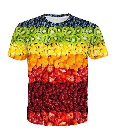


Fashion’s hungry right now, and food-inspired style is feeding the vibe. This isn’t some cute-for-a-week trend; it’s fashion finally having fun again. Juicy fruit prints, candy-sweet colors, snack graphics, comfort food you feel emotionally attached to, on clothes? Yes. And it works. People are done dressing like it’s an assignment. Food-core throws the rulebook out; playful, familiar, a little chaotic, but in a way that just works. It’s messy on purpose, comfortable in its own skin, and way more fun than trying to look “put together” all the time. These pieces make you grin, get comments, start conversations, and don’t demand fashion literacy to pull off. Nostalgic, comforting, unserious on purpose.
Food-core fashion draws inspiration from cravings, featuring fruits, snacks, candy colors, and playful details that feel irresistibly fun. Here are some trendy categories to try:
Fruit and produce prints feel like clothes that woke up happy. Cherries, lemons, strawberries, or even tomatoes and peppers. Sometimes they whisper as a tiny stitch tucked on a sleeve. Other times, they go full main-character, splashed loud across hoodies and tees. Soft flex or full drama; either way, they show up and steal the mood.
Soft or dramatic, cute or chaotic. Want soft? Pastel sketches, tonal embroidery. Want loud? Bright colors, oversized prints, puff details you can actually feel. Even buttons, patches, and labels get fruity. That’s the fun of it; same motif, totally different energy. Cute one day, ironic the next, nostalgic or bold depending on how you wear it.

Snack and food graphics are basically comfort food, but make it fashionable. Burgers, fries, donuts, croissants, ramen, coffee cups… the kind of stuff everyone loves, now living rent-free on hoodies and tees. Some lean sweet and cartoonish.
Some stay clean, calm, barely saying a word. Then color takes over, warm browns, buttery yellows, soft pinks, or a sudden neon punch. Add puff prints, stitched outlines, textured patches… and yeah, now it looks so good it’s almost snackable. The best part? These designs don’t try to be serious. They’re fun, familiar, and guaranteed to start a “wait, that’s cute” conversation.

Candy colors don’t need a hype squad; they are the hype. Bubblegum pink, mint, lemon yellow, lavender, baby blue, peach, soft lilac… instant mood lift. These shades flip basic hoodies and knits into feel-good fits without doing the most. Keep it clean with solid blocks or play with color-blocking. Keep it polished, not childish. Washed finishes mellow everything out, so it stays wearable. Style with denim or neutrals, or go full matching set if you’re bold. Joy on autopilot.

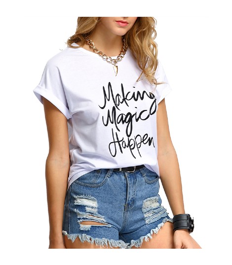
Food-inspired typography is basically words with appetite. Phrases like Freshly Baked, Sweet Tooth, or Extra Spicy don’t sit there politely; they land. Pull fonts straight from diner menus, candy wrappers, dusty old packaging, and suddenly, text has flavor. Go big on the front if you want eyes on you, keep it tiny on the chest if you’re feeling slick, or let it stretch across the back and do the talking.
Handwritten styles feel casual and cozy, chunky fonts bring attitude. Add puff print, embroidery, or stitched lettering, and it pops even more. It works because everyone gets it; food is universal, and this kind of design lets fashion joke around without trying too hard.

This one runs on pure nostalgia. Noodles at midnight, fries you didn’t plan to eat, milk cartons from childhood, snacks that feel like home. The graphics look a little worn, a little imperfect, as they’ve already lived a life. That’s the charm. Cozy, ironic, familiar in a way you can’t fake. And honestly, why does it work so well? Because comfort food and comfort clothes hit the same nerve.

This trend keeps things quiet and thoughtful. Soft sketches, imperfect lines, market-style lettering, natural shapes, muted earthy colors. Tomatoes with stems still on, olive branches, bread loaves, little notes that say “locally grown.” Nothing loud, nothing busy. It feels slow, calm, and considered, like fashion that takes a breath. Perfect for labels that want food inspiration to feel artistic, not gimmicky, and wearable long after the trend cycle moves on.

Food-meets-feelings graphics work because they say what everyone’s already thinking. A hoodie that says “Powered by Coffee” or shows fries with a tired face doesn’t try to be clever; it’s just honest. These designs land because they’re funny without forcing it and relatable without trying too hard. Big prints, small chest hits, front or back, it all works. Change the colors and the mood shifts, but the feeling doesn’t. It still feels real, easy to wear, and perfectly right for right now.

If you’re a business owner ready to turn trends into product, partner with a reliable clothing supplier who understands quality. Make more sales and turn in more customers to the store.